Temperature and Precipitation Probabilistic Forecasts
Current Temperature and Precipitation Probabilistic Forecasts
| Period | 1-3 month | 2-4 month | 4-6 month | 7-9 month | 10-12 month |
|---|---|---|---|---|---|
| Temperature | Map| Reliability | Map|Reliability | Map|Reliability | Map|Reliability | Map|Reliability |
| Precipitation | Map| Reliability | Map|Reliability | Map|Reliability | Map|Reliability | Map|Reliability |
Probabilistic Forecasts Issued at the Beginning of the Previous Month
| Period | 1-3 month | 2-4 month | 4-6 month | 7-9 month | 10-12 month |
|---|---|---|---|---|---|
| Temperature | Map| Reliability | Map|Reliability | Map|Reliability | Map|Reliability | Map|Reliability |
| Precipitation | Map| Reliability | Map|Reliability | Map|Reliability | Map|Reliability | Map|Reliability |
Probabilistic Forecasts Issued Two Months ago
| Period | 1-3 month | 2-4 month | 4-6 month | 7-9 month | 10-12 month |
|---|---|---|---|---|---|
| Temperature | Map| Reliability | Map|Reliability | Map|Reliability | Map|Reliability | Map|Reliability |
| Precipitation | Map| Reliability | Map|Reliability | Map|Reliability | Map|Reliability | Map|Reliability |
What do these maps represent ?
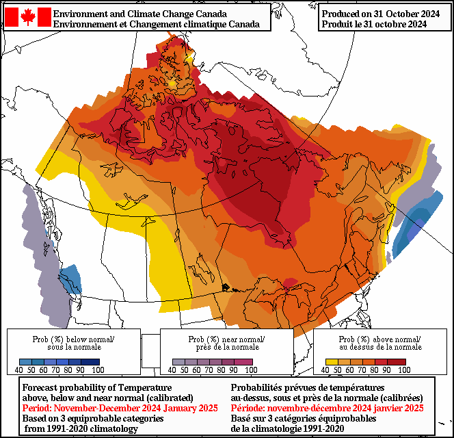
The probabilities for the below, near or above normal tercile categories are shown for temperature and precipitation for various lead times, ranging from months 1-3 of the forecast period to months 10-12. In each case, 4 maps and a reliability diagram are shown. The first map displays at each location the probability for the most likely category. (The map for 1-3 month temperatures is reproduced at the top of this page.) In these maps, white over Canada represents regions of "equal chance" where forecast probabilities for none of the three categories exceed 40%, and hence where the categories are nearly equally probable. The occurrence of the white colour areas over Canada is more predominant for precipitation forecasts, which are generally less skillful than temperature forecasts, and increases with forecast range at longer lead times. The increasing occurrence of areas coloured in white over Canada implies diminishing ability of the forecasting system to make reliable and accurate predictions in these regions.The next 3 maps show the probabilities for each category individually.
Finally, the reliability diagram, also known as attributes diagram, shows, for all locations in Canada, the frequency with which each category occurs (vertical axis) versus the probability with which it was forecast (horizontal axis). Ideally, the observed frequencies should equal the forecast probabilities, in which case the dots in the reliability diagrams would lie along the diagonal dashed line. To improve this property of the forecasts, a calibration method has been applied. To use the forecasts optimally it is strongly recommended to read carefully the user guide!
How are these forecasts produced?
The seasonal forecasts are based on a 20-member ensemble of predictions,
10 members from each of two coupled atmosphere-ocean-land physical climate models.
The forecast probabilities are estimated by first
computing the anomalies or departures from normal
for each ensemble member and then applying the
calibration procedure
to these values. (Forecast
probabilities prior to June 2013 were
uncalibrated, and obtained by counting the
ensemble members in each of the three categories and
then dividing by the ensemble size.)
Features
Canada's 10 most impactful weather stories of 2024

Find out which weather events made the list
- Date modified:
